A font can often make or break a website. Fonts play a significant role in the visual appeal of a website, and choosing the correct font can go a long way toward making a site more appealing to your users. There are several things to consider when choosing a font for your website, including legibility and visual appeal. It’s also important to choose a web-safe font so it works well on all devices, browsers, and operating systems.
5 types of web fonts
Fonts are generally classified into five categories. They all have distinctive characteristics and are used for different purposes. The five categories are Serif, Sans-serif, Monospace, Cursive, and Fantasy.
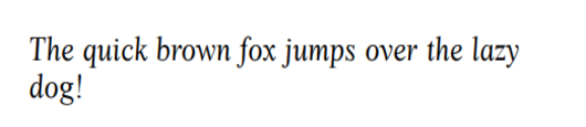
Serif
Serif fonts are recognizable by the small extra strokes on the edges of letters. Serif fonts are often used on websites because they’re highly legible. They also look formal and are used in academic writing, print media, etc. Some of the most widely-used Serif fonts are Times New Roman, Cambria, and Garamond.
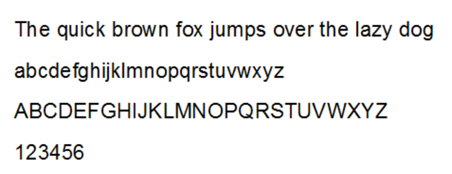
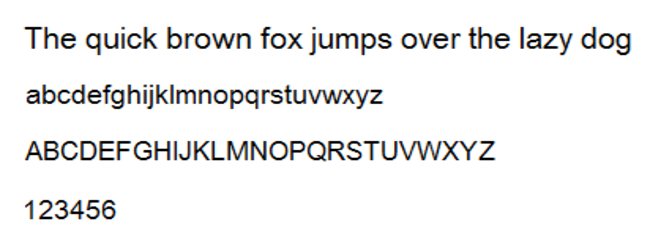
Sans-serif
Sans-serif fonts do not have the additional strokes that are added to Serif fonts. Fonts from this family have a minimalistic feel and wide spaces between letters, which makes them highly legible fonts. They’re often used for print and digital content.
Monospace
Monospace fonts have very distinctive, wide spaces between letters, giving them a very clean look. They are often associated with typewriters and computer terminals because that’s where users encounter them most often. Courier is one of the most widely-used Monospace fonts.
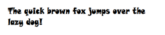
Cursive
As the name implies, Cursive fonts imitate handwriting, with letters looping together in a flowing manner. Cursive fonts are rarely used in blocks of text because they can be hard to read. Instead, they’re more often used for blog title posts and headers.
Fantasy
Fantasy fonts have a very distinctive, creative look. They’re very decorative, which makes them good for movie titles (e.g. Harry Potter), novel titles, video games, etc.
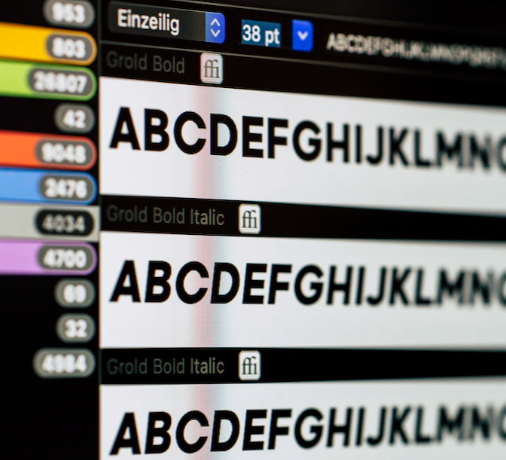
HTML fonts
You can find 20 web-safe fonts that you can use for your website below.
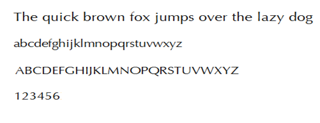
Arial
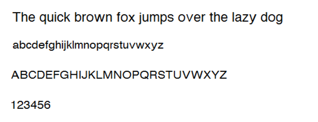
The Arial belongs to the Sans-serif font category. It’s a classic font that’s mostly suitable for all websites. It’s a very minimalistic font with a clean look. It’s easy to read, which is why it’s often used in printed media such as newspapers. You can’t go wrong with Arial, so if you’re looking for a font to give your site a clean and polished look, this is a good choice.
Arial Narrow
Arial Narrow is a style of the Arial font family. As the name implies, the font appears narrow, like the letters were pushed together. It has a pretty minimalistic look, which makes it a good choice for websites that need a simple, polished look.
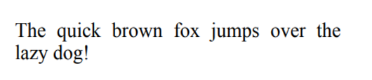
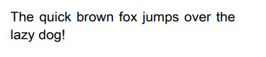
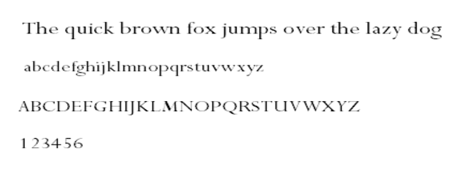
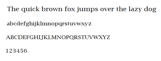
Times
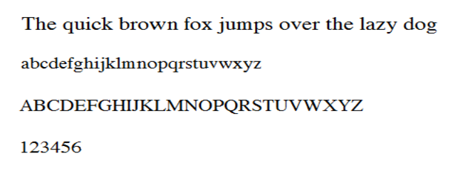
Times is another classic font that quickly became the default font for printed media and academic writing. This is one of the fonts that most people are used to seeing so it’s a good choice if you want your website to have a familiar feeling. It’s also a great font for sites that have a lot of text (e.g. blogs).
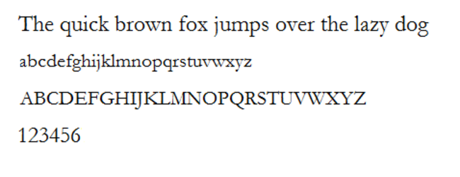
Times New Roman
Times New Roman is a variant of the Times font. It’s perhaps the most widely used font overall because it’s accepted as the default font for academic writing and printed media. It’s a good choice if you want your site to look professional and polished.
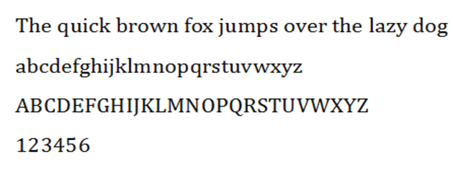
Helvetica
Helvetica is a widely used sans-serif typeface. You may recognize it being used for commercial wordmarks for popular brands like Adult Swim, Panasonic, Skype, Verizon, and Funimation. It’s also often used for health warnings on tobacco products in the EU, as well as for federal income tax forms in the US. Helvetica is a very versatile font that has a clean look. It’s suitable for all kinds of websites.
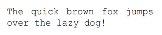
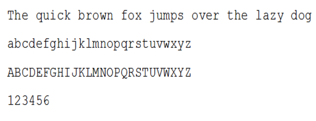
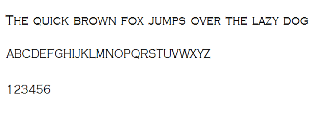
Courier
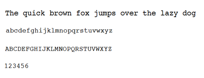
Courier has a very distinctive look, with big spaces between letters. Courier is a great choice if your site is related to movies because it’s the default font for movie screenplays. However, it’s not generally used for long pieces of text. It’s better used for titles on websites as it’s more decorative than anything.
Courier New
Courier Now is like a thinner version of the Courier font. You may recognize it as the default system font in electronic devices.
Candara
Candara is classified as a humanist sans-serif typeface and was initially released with Windows Vista. It’s part of Microsoft’s ClearType font collection.
It’s a clear, highly-readable font, which makes it perfect for displays and blog post titles. However, it has a bit of an old-school feel to it.
Verdana
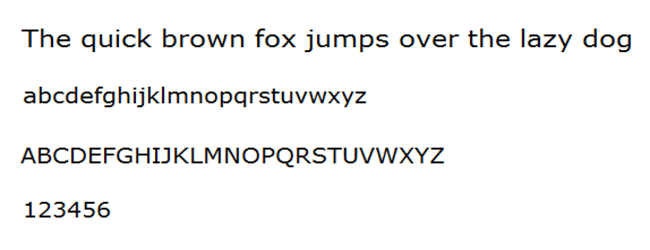
Verdana is a sans-serif font. It’s a very clear, readable font with big spaces between letters. The font was used by the Scandinavian furniture giant IKEA for years but it recently switched to another.
It’s a good font for both long blocks of text and headlines. If you need to put a lot of text in a small space, Verdana is a good choice because it’s still very readable when in a small size.
Calibri
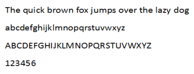
Calibri is a sans-serif typeface. It currently is the default typeface of Microsoft Office and other Microsoft software and has been since 2007, though Microsoft is planning on changing it. Calibri has a modern look with a warm feel because of the rounded lines. It’s suitable for many text sizes because of its legibility. Because it has a clean look, it can be used for all types of websites.
Optima
Optima is a sans-serif typeface. It has a clean look with a classic yet elegant feel. It’s used by some high-end brands like Marks and Spencer.
it’s a very versatile font that particularly suits blog posts, books, and landing pages.
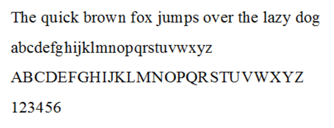
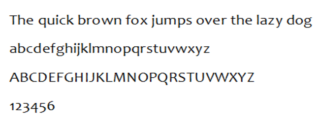
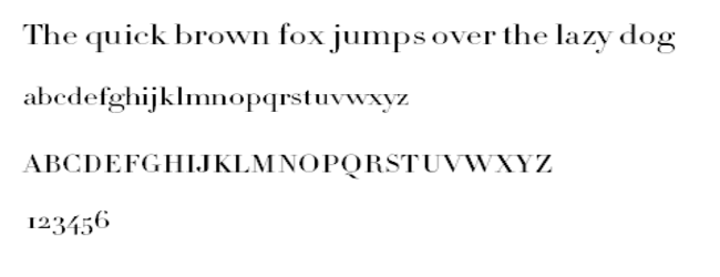
Cambria
Cambria is a serif font. It has a very modern feel, and the horizontal serifs make it a very clear, legible font. It’s also quite versatile and is great if you need to place large blocks of text in small spaces.
Perpetua
Perpetua is a serif typeface. It’s formal and elegant with a classic appearance. Perpetua is a popular choice for fine book printing and has a creative feel to it. It’s also a good font for educational and informational texts.
Garamond
Garamond is a serif font. It has a bit of an antique feeling to it, and you may recognize it from printed books like Harry Potter. It’s a common font choice for printed books and digital displays.
Didot
Didot is a serif font. It has a classic design that does not look outdated. It has a formal, esthetically-pleasing look so it’s a good font choice for headers and taglines. It’s also often used for logos. Didot was used for the CBC News logo in the past. It’s also the font used in the current logo for The Late Show with Stephen Colbert.
Brush Script
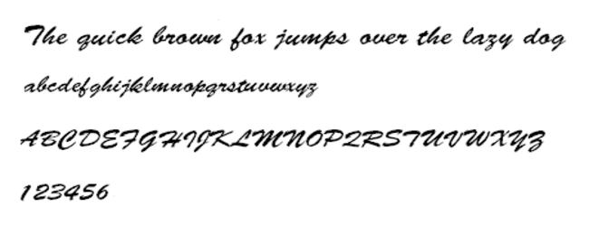
Brush Script is a cursive font that mimics handwritten strokes. It feels casual/informal and should be used sparingly. It’s a good font for posters, pop-ups, and landing pages. But it should be avoided on websites in large blocks of text as it becomes difficult to read, especially when in small text size.
Lucida Bright
Lucida Bright is a serif font. It looks official and clean, which is why it’s a good choice for official documentation, magazines, and even business reports.
Monaco
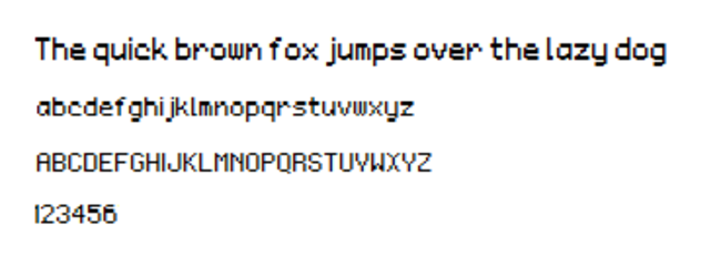
Monaco is a monospaced sans-serif typeface that’s often used in macOS. While it’s a pretty simple font, it also stands out. It’s a good choice for landing pages, pop-ups, etc., especially when you want to draw attention.
Copperplate
Copperplate is a monotone font and uses only capital letters. It’s a great option for headers and titles on websites but is also often used for business cards. The font featured heavily on the show Who Wants to be a Millionaire.
Bradley Hand
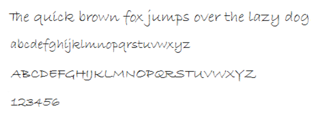
Bradey Hand is a cursive font that resembles handwriting. It’s a good choice for decorative text for advertising and branding but should be used sparingly. It has a casual and more personal feel so it’s a good choice when you want to create a more cozy feeling.
How to add HTML fonts
You can add HTML fonts to your WordPress website either manually or using plugins.
Add HTML fonts manually
It’s generally easier and quicker to use plugins but if you do not wish to add even more plugins to your WordPress website, you can add HTML fonts manually.
- Download the font of your choice from a web font provider.
- Convert the font into a web-friendly format using the Webfont Generator tool.
- Download the converted font, and upload it to wp-content/themes/your-theme/fonts directory.
Add HTML fonts using plugins
Using plugins to add fonts is much easier, particularly if you do not have a lot of experience with doing it manually. There are many HTML font plugins that you can add to your WordPress website.
You can install WordPress plugins in a couple of ways, and it’s not difficult. Here’s how you can install plugins via the WordPress admin screen:
- Plugins -> Add New.
- Using the gallery of plugins or the search function, find the plugin(s) you want to use and click Install Now.
- Once the plugin is installed, you need to press Activate to turn it on.
It’s also possible to install WordPress plugins that you obtained from third-party sources. However, you need to be very careful about which plugins you install and where you download them from because malicious actors often try to use plugins to upload malicious code to websites. Only download trusted plugins from reliable sources. To add a plugin you downloaded from a third-party source, use the below instructions:
- Download the plugin’s ZIP file from a reliable source.
- Plugins -> Add New -> Upload Plugin.
- Either drag the ZIP file or upload it.
- Click Install Now.
- Click Activate Plugin.